Versions Compared

Key

  • This line was added.
  • This line was removed.
  • Formatting was changed.

...

Tip

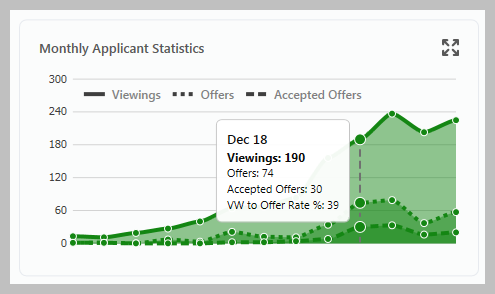
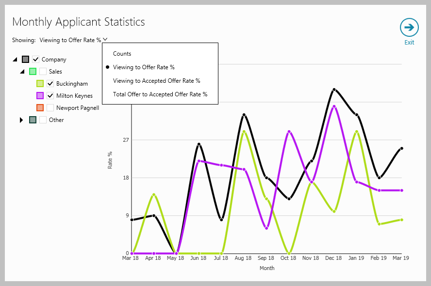
This chart shows applicant statistics for the previous 12 months plus the current month - hovering over the chart gives a summary for the chosen month 

Image RemovedImage Added
  • Clicking the above chart displays a new chart in a separate window (as shown below) where, when viewing multiple offices, individual offices can be chosen

  • Figures shown can be changed from Viewing to Offer Rate % to other options (as shown right) - click the current view setting to change

Info

Hovering over the chart above gives more information in a tooltip, clicking the chart shows a data grid - see General tips for using the dashboard section above for more information

Registered Applicants by Location

...

Accessing Settings

  • Click cog icon (top right of dashboard)

    See next step for all available options

Settings options

All Settings options are shown below
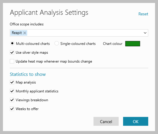
Image RemovedImage Added
  • Office scope includes
    Choose the office(s) you wish to include when selecting Office at the top of the Applicant Analysis screen

  • Chart colour

    • Select from Multi-coloured or Single-coloured charts, when choosing single-coloured, the Chart colour used can be chosen 

    • Tick/untick Use silver style maps to change the colouring of the map

  • Update heat map whenever map bounds change
    Allows you to choose if the heat map is updated each time changes to the map are made

  • Statistics to show
    Use the boxes to choose which charts/statistics to show on the dashboard

...