...
The Portal Analysis dashboard, one of the Management Information (MI) real-time dashboards available in AgencyCloudReapit, offers inbuilt real-time analysis of portal leads received
...
On the main menu, click Reports, and in MI Analysis, select Portal Analysis:
...
1. View data at company or office level and select month to report on Use the filter options top left to: Report on one/more offices or the whole company (where security settings allow)
Use the filter options at the top left of the dashboard to select Office or Company
The office data shown can be changed via the Settings screen - see section 5
Report by month
Use the Date filter menu to select a month to report on - up to one year previous to the current month is available
|
2. Applicant Internet Registrations This chart displays, for the selected month, the amount of applicants sending their details to you and from which portal their enquiry originated Hovering over the chart and chart background will display more information in a tooltip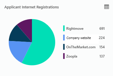 Image Modified Image Modified Click the grid icon (top right) to view a breakdown of the data behind it
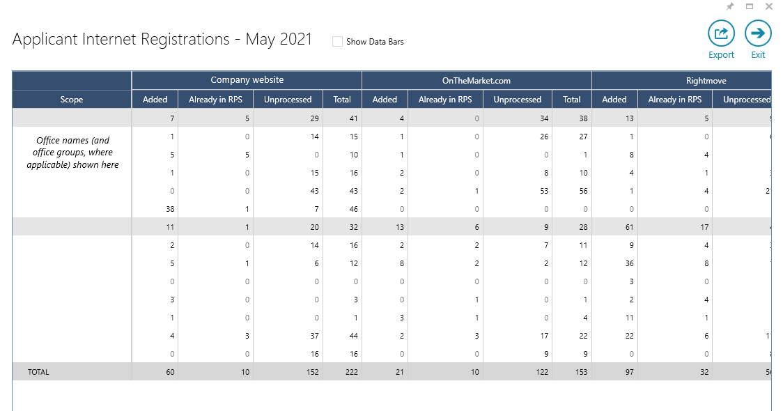 Image Modified Image Modified Clicking any number in the grid displays the actual internet registrations received that make up the figure
| Expand |
|---|
| title | Export & Data Bars functions |
|---|
| Export Clicking Export pulls the data from the table into an Excel spreadsheet Data bars 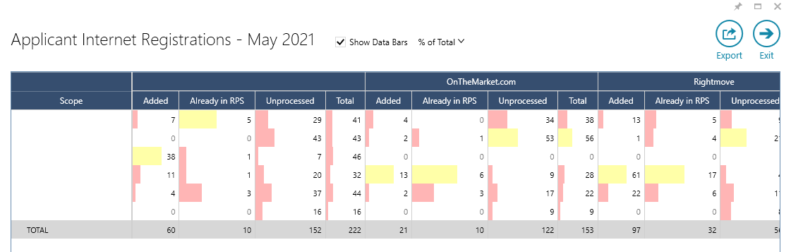 Image Modified Image ModifiedTicking Show Data Bars displays coloured bars that represent each figure based on its ratio with the percentage of the Total figure The shading width and colour differs to indicate the % share of the overall total of that figure; green shading indicates the figure being in the top third of the overall figure, yellow indicates the middle third and red the bottom third |
|
3. Property Internet Registrations This chart displays, for the selected month, the amount of valuation requests received and from which portal their request originated Hovering over the chart and chart background will display more information in a tooltip 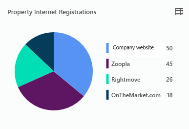 Image Modified Image ModifiedClick the grid icon (top right) to view a breakdown of the data behind it
The same format is used as seen in the grid example shown in section 2
Clicking any number in the grid displays the actual internet registrations received that make up the figure
|
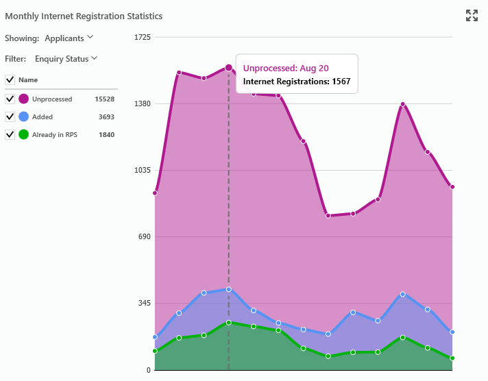
4. Monthly Internet Registrations Statistics This chart displays data for applicant leads or valuation/property leads over the period of a year The chart can be changed depending on what data is important to you From the Showing menu: From the Filter menu, options are: Source shows which portal the enquiries originated from Enquiry Status shows what happened to each enquiry - does it remain unprocessed, was it added to
|
AgencyCloud AgencyCloud AgencyCloud Reapit as a result of a portal lead Office shows portal leads by office
Click any point in the chart to view the breakdown of the data behind it in a grid
The same format is used as seen in the grid example shown in section 2
Clicking any number in the grid displays the actual internet registrations received that make up the figure
Click the 4-headed arrow (top right) to view more chart options
A new chart view is displayed, see two examples below
When set to Filters (top left): Filter options on the left of the screen are offered, allowing you to be more specific with the data shown 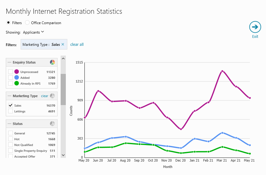 Image Modified Image ModifiedClick the pie chart icon to switch the graph type (i.e. Source, Enquiry Status, Marketing Type, Status etc.)
E.g. as the Marketing Type filter of Sales is enabled on the Enquiry Status graph type - this chart is showing the actions taken with all sales leads received over this period
When set to Office Comparison (top left): Specific offices can be chosen (on left) Value to show can be set to applicants, properties or both 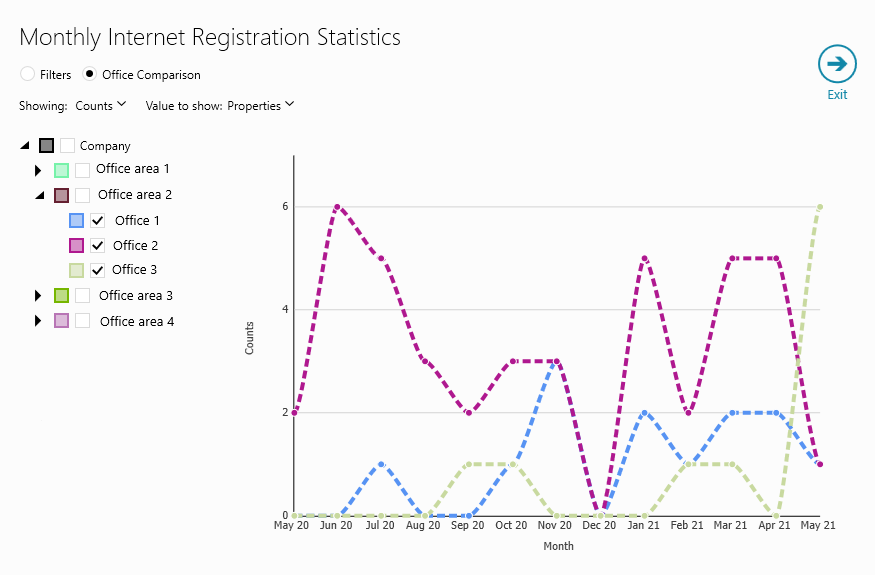 Image Modified Image ModifiedE.g. this chart shows the number of valuation leads received between 3 offices
|
5. Settings options From top right of dashboard: Click Settings (cog icon)
Portal Analysis Settings screen will be displayed
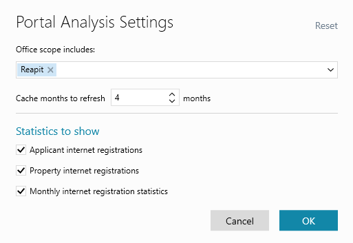 Image Modified Image Modified Office scope includes
Choose the office(s) you wish to include when selecting Office at the top of the Portal Analysis screen
Cache months to refresh
The first time the report is loaded, the counts for the graphs are stored (or cached) - meaning that, on subsequent launches of the dashboard, the graphs will load quicker Statistics to show
Use these options to decide which charts are shown in the dashboard (as seen in steps 2-4 above)
|
6. Changing the colour scheme The colour scheme used for the charts can be changed where a colour circle is shown For example, from the Monthly Internet Registration Statistics chart: Click the colour circle you wish to change 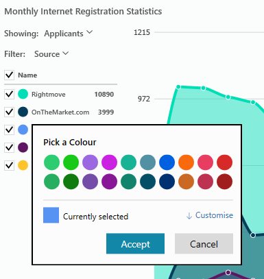 Image Modified Image ModifiedPick a colour from the palette
Or click Customise for a more specific shade (and/or to enter RGB values)
Click Accept
The new colour will be used on all charts for that value type
|
Related articles
| Filter by label (Content by label) |
|---|
| showLabels | false |
|---|
| max | 5 |
|---|
| spaces | com.atlassian.confluence.content.render.xhtml.model.resource.identifiers.SpaceResourceIdentifier@a45 |
|---|
| sort | modified |
|---|
| showSpace | false |
|---|
| reverse | true |
|---|
| type | page |
|---|
| cql | label = "portal" and type = "page" and space = "RW" |
|---|
| labels | rps sales reporting dashboard productguide |
|---|
|
...