...
The Withdrawal Analysis dashboard, one of the Management Information (MI) real-time dashboards available in AgencyCloudReapit, offers inbuilt real-time analysis of the withdrawn sales property data held in your Reapit database
...
Accessing the dashboard, using the date & office filters plus general tips
Access the dashboard 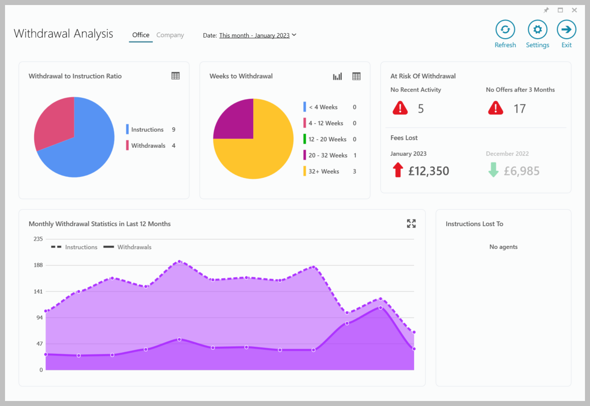 Image Modified Image ModifiedChoose which data to view - Office(s) or Company Choose which month to view General tips for using the dashboard Use the Settings section to change how data is shown Hover over charts & statistics to see a tooltip which displays more information about the figure Click on a blank area of a panel to see the data behind the chart or statistic in a grid
Click on a section of a chart to see the data for just that area When viewing the data in a grid, use grid functions to sort the data and export to Excel
See the Data grids section for more information
|
Withdrawal to Instruction Ratio
| Tip |
|---|
Withdrawal to instruction ratio for the current month, based on the instruction and withdrawal dates |
| 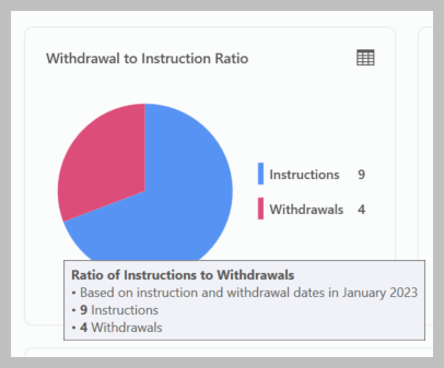 Image Modified Image Modified |
Weeks to Withdrawal
| Tip |
|---|
Number of properties withdrawn in relation to when they were instructed |
Hover over the chart area for a summary
Option to change pie chart to column chart (top right)
Click grid icon (top right) to see the data behind the chart
| 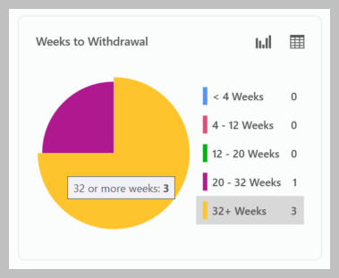 Image Modified Image Modified |
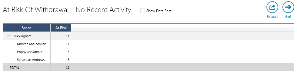
At Risk of Withdrawal
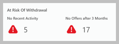 Image Removed
 Image Added Image AddedNo Recent Activity | Tip |
|---|
Number of properties instructed for a specific number of months or more that are for sale/available but haven’t had any recent viewings or contact from the agent |
No Offers after 3 months | Tip |
|---|
Number of properties instructed for a specific number of months or more that have had no offers |
|
| Info |
|---|
The periods in weeks/months used for No Recent Activity and No Offers can be changed - see Settings section for more information |
Fees Lost
| Tip |
|---|
Total of fees lost in this month and last month due from withdrawn properties |
| 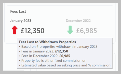 Image Modified Image Modified |
Monthly Withdrawal Statistics in Last 12 Months
| Tip |
|---|
Instruction and withdrawal counts for the whole company over the past full 12 months |
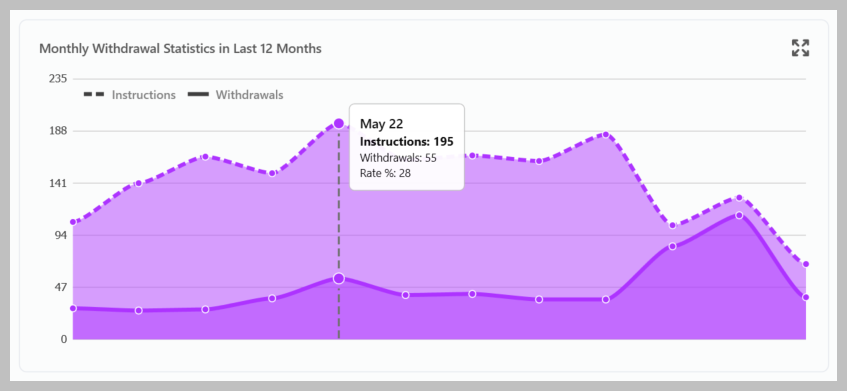 Image Modified Image Modified |
Withdrawal Reasons and Instructions Lost To
| Tip |
|---|
Withdrawal reasons and agents withdrawn properties have been lost to in the selected month |
|
AgencyCloud 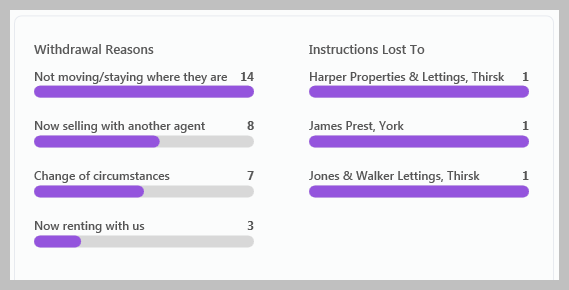 Image Modified Image Modified |
Settings
Accessing Settings | 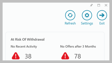 Image Modified Image Modified |
Settings options All Settings options are shown below |
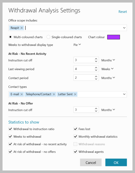 Image Removed
 Image Added Image AddedOffice scope includes
Choose the office(s) you wish to include when selecting Office at the top of the Withdrawal Analysis screen
Chart colour Weeks to withdrawal display type
Select the type of chart to use for the Weeks to Withdrawal statistic- options are Pie or Column
At Risk - No Recent Activity Instruction cut off - number of months a property is on the market with no activity before it is flagged as 'at risk' Last viewing period - number of weeks without a viewing before a property is flagged as 'at risk' Contact period - number of months before a vendor who hasn't been contacted is flagged as 'at risk' - see below for what types of contact are considered Contact types - the contact types (as logged in the journal) which is classed as contact with a vendor
At Risk - No Offer Statistics to show
Use the boxes to choose which charts/statistics to show on the dashboard
Withdrawal reasons are only available when set-up on
|
AgencyCloud Data grids
Viewing data grids Data grids are available to allow you to drill down to view the data behind the chart/statistic Click on a blank area of a panel to see the data behind the whole chart/statistic in that panel
OR Click on a section of a chart to see the data for just that area See example in next section Clicking any figure within the breakdown displays the related property records, allowing individual records to be viewed
|
Data grid features Click the column heading(s) to sort by that column (ascending/descending) Click Export to export the data shown to an Excel spreadsheet Click a figure in the grid to see the associated records
In the example above, when clicking a figure, the relevant list of properties will be displayed
|
Show data bars 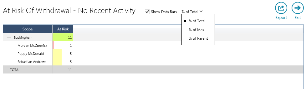 Image Modified Image ModifiedTicking Show Data Bars displays coloured bars that represent each figure based on its ratio with the percentage of the Total figure (options to show % of Max/Parent are also available) The shading width and colour differs to indicate the % share of the overall total of that figure; green shading indicates the figure being in the top third of the overall figure, yellow indicates the middle third and red the bottom third
|
Related articles
| Filter by label (Content by label) |
|---|
| showLabels | false |
|---|
| max | 5 |
|---|
| spaces | com.atlassian.confluence.content.render.xhtml.model.resource.identifiers.SpaceResourceIdentifier@a45 |
|---|
| showSpace | false |
|---|
| sort | modified |
|---|
| showSpacetype | falsepage |
|---|
| reverse | true | type | page
|---|
| labels | rps sales reporting dashboard productguide |
|---|
| cql | label in ( "reporting" , "withdrawals" ) and type = "page" and space = "RW" | labels | rps sales reporting dashboard productguide |
|---|
|
| Excerpt |
|---|
|
Outline of the main features and how to use the Withdrawal Analysis dashboard |
...