...
The Applicant Analysis dashboard, one of the Management Information (MI) real-time dashboards available in AgencyCloudReapit, offers inbuilt real-time analysis of the applicant data held in your sales database
...
Accessing the dashboard, using the date & office filters plus general tips
Access the dashboard 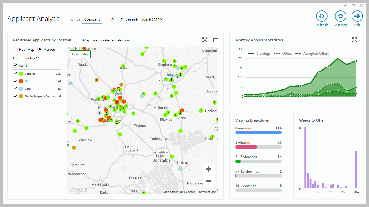 Image Modified Image ModifiedEach panel is covered below - click a link to jump to a specific section Choose which data to view - Office(s) or Company Choose which month to view General tips for using the dashboard Use the Settings section to change how data is shown Hover over charts & statistics to see a tooltip which displays more information about the figure Click on a blank area of a panel to see the data behind the chart or statistic in a grid
Click on a section of a chart to see the data for just that area When viewing the data in a grid, use grid functions to sort the data and export to Excel
See the Data grids section for more information
|
Monthly Applicant Statistics
| Tip |
|---|
This chart shows applicant statistics for the previous 12 months plus the current month - hovering over the chart gives a summary for the chosen month |
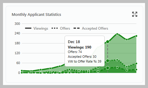 Image Modified Image ModifiedClicking the above chart displays a new chart in a separate window (as shown below) where, when viewing multiple offices, individual offices can be chosen 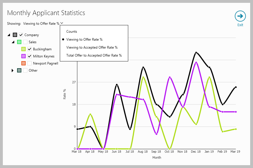 Image Modified Image ModifiedFigures shown can be changed from Viewing to Offer Rate % to other options (as shown right) - click the current view setting to change
| Info |
|---|
Hovering over the chart above gives more information in a tooltip, clicking the chart shows a data grid - see General tips for using the dashboard section above for more information |
|
Registered Applicants by Location
| Tip |
|---|
This map shows registered applicants according to their location, options on the left of the map allow the applicants shown to be filtered by type |
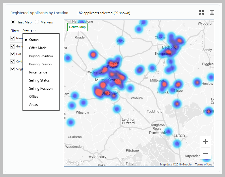 Image Modified Image Modified| Expand |
|---|
| - Use the + and – buttons (or mouse wheel) to zoom in and out - Click and drag the map to move position - After making changes to the map, Centre Map displays it in its original position |
Choose to view in Heat map or Markers view
In Markers view, hovering over the applicant on the map displays applicant information and clicking the map will display the relevant applicant record
Click Filter to change how the applicant data is shown and to choose to display specific applicant types, for example, selecting Selling Status then Renting will only display applicants currently renting
Clicking the 4-headed arrow icon (top right) opens the map in full screen with all available filters shown on the left
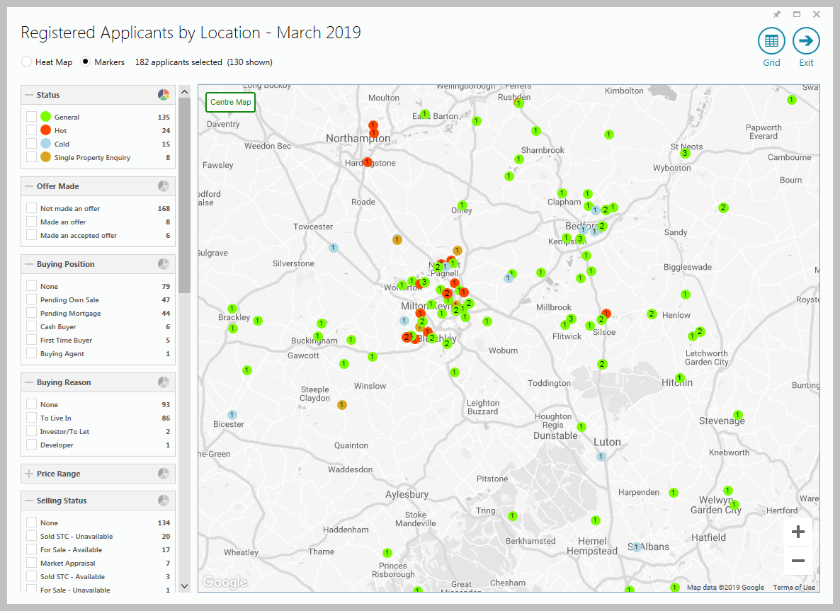 Image Modified Image Modified |
Viewing Breakdown
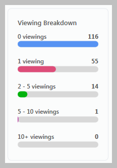 Image Modified Image Modified |
Weeks to Offer
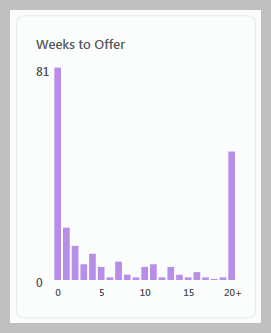 Image Modified Image Modified |
AgencyCloud Settings
Accessing Settings |  Image Modified Image Modified |
Settings options All Settings options are shown below 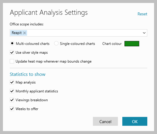 Image Modified Image ModifiedOffice scope includes
Choose the office(s) you wish to include when selecting Office at the top of the Applicant Analysis screen
Chart colour Select from Multi-coloured or Single-coloured charts, when choosing single-coloured, the Chart colour used can be chosen Tick/untick Use silver style maps to change the colouring of the map
Update heat map whenever map bounds change
Allows you to choose if the heat map is updated each time changes to the map are made
Statistics to show
Use the boxes to choose which charts/statistics to show on the dashboard
|
Data grids
Viewing data grids Data grids are available to allow you to drill down to view the data behind the chart/statistic Click on a blank area of a panel to see the data behind the whole chart/statistic in that panel
OR Click on a section of a chart to see the data for just that area See example in next section Clicking any figure within the breakdown displays the related applicant records, allowing individual records to be viewed
|
Data grid features The data behind a chart/statistic clicked is shown in a grid
The example below is shown when clicking the Viewing Breakdown panel 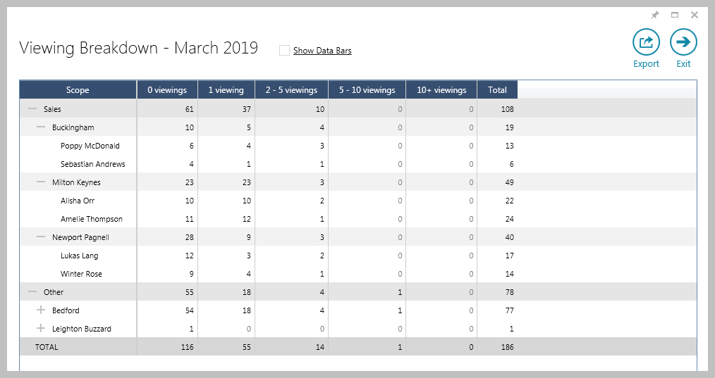 Image Modified Image ModifiedClick the column headings to sort by that column (ascending/descending) Click Export to export the data shown to an Excel spreadsheet Click a figure in the grid to see the associated records
In the example above, when clicking a viewing figure, the relevant list of applicants will be displayed
|
Show Data Bars Ticking Show Data Bars displays coloured bars that represent each figure in the grid based on its ratio with the percentage of the total figure 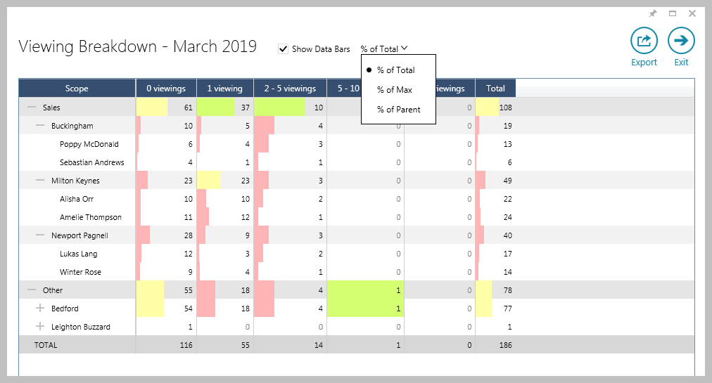 Image Modified Image ModifiedClick % of Total drop-down menu to change this to show a percentage of the Maximum (Max) figure or show a percentage of the Parent figure (e.g. for a negotiator, the parent value is the office)
The shading width and colour differs to indicate the % share of the overall total of that figure - green shading indicates the figure being in the top third of the overall figure, yellow indicates the middle third and red the bottom third
|
Related articles
| Filter by label (Content by label) |
|---|
| showLabels | false |
|---|
| max | 5 |
|---|
| spaces | com.atlassian.confluence.content.render.xhtml.model.resource.identifiers.SpaceResourceIdentifier@a45 |
|---|
| sort | modified |
|---|
| showSpace | false |
|---|
| reverse | true |
|---|
| type | page |
|---|
| cql | label = "applicant" and type = "page" and space = "RW" |
|---|
| labels | rps sales reporting dashboard productguide |
|---|
|
...