...
The Data Accuracy Analysis dashboard, one of the Management Information (MI) real-time dashboards available in AgencyCloudReapit, focuses on the accuracy of applicant and property data entered in your database. It is a great tool for ensuring that your users are entering /updating data accurately.
This real-time dashboard will help you to easily pinpoint problem areas in your data and take quick action, resulting in a more reliable database, long term
AgencyCloud is Reapit is feature-rich for contact management and reporting tools, both of which require a reliable database to ensure a reliable output
Accessing the dashboard & using the office filters plus general tips
Access the dashboard 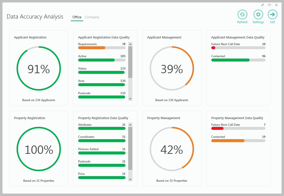 Image Modified Image ModifiedEach panel is covered below - click a link to jump to a specific section Choose which data to view - Office(s) or Company | Info |
|---|
The default is for the data to show information as it currently stands - this can be changed via Settings (ticking Apply date filter to reports adds a drop-down menu to the top of the dashboard allowing a specific month within the last year to be selected) |
General tips for using the dashboard Use the Settings section to change how data is shown Hover over charts & statistics to see a tooltip which displays more information about the figure Click a panel to see the data behind the chart/statistic in a grid
Click on a section of a chart to see the data for just that area When viewing the data in a grid, use grid functions to sort the data and export to Excel
See the Data grids section for more information
|
Applicant Registration & Applicant Registration Data Quality
Applicant Registration Applicant Registration quality - as a percentage Hovering over the chart highlights how many applicant records are being reviewed plus the amount of applicants with the data entered
Clicking the chart shows a grid highlighting the areas where data is missing (can be changed to where data has been entered)
Clicking the grid shows the relevant applicants
| 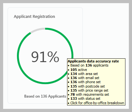 Image Modified Image Modified |
Applicant Registration Data Quality Applicant Registration quality - broken down by data type Hovering over the chart highlights how many applicant records are being reviewed
Clicking the chart shows a grid highlighting the areas where data is missing (can be changed to where data has been entered)
Clicking the grid shows the relevant applicants
| 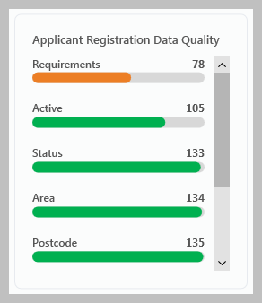 Image Modified Image Modified |
Applicant Management & Applicant Management Data Quality
Applicant Management Applicant Management quality - as a percentage Hovering over the chart highlights how many applicant records are being reviewed and, out of those, how many have been contacted and how many have a future next call date set
Clicking the chart shows a grid highlighting the areas where the contact is missing (can be changed to where contact has been entered)
Clicking the grid shows the relevant applicants
| 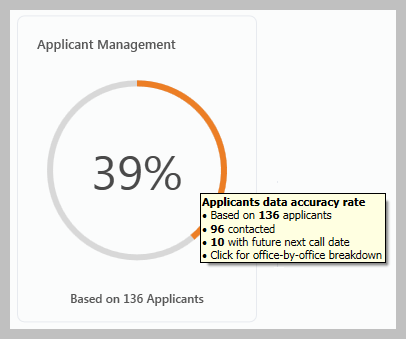 Image Modified Image Modified |
Applicant Management Data Quality Applicant Management quality - broken down by type Hovering over the chart highlights how many applicant records are being reviewed
Clicking the chart shows a grid highlighting the areas where the contact is missing (can be changed to where contact has been entered)
Clicking the grid shows the relevant applicants
| 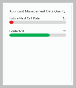 Image Modified Image Modified |
| Info |
|---|
How often contact is required and what is classed as ‘contact’ can be changed - see Settings section for more information |
Property Registration & Property Registration Data Quality
Property Registration Property Registration quality - as a percentage Hovering over the chart highlights how many property records are being reviewed plus the amount of properties with the data entered
Clicking the chart shows a grid highlighting the areas where data is missing (can be changed to where data has been entered)
Clicking the grid shows the relevant properties
| 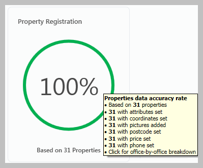 Image Modified Image Modified |
Property Registration Data Quality Property Registration quality - broken down by data type Hovering over the chart highlights how many property records are being reviewed
Clicking the chart shows a grid highlighting the areas where data is missing (can be changed to where data has been entered)
Clicking the grid shows the relevant properties
| 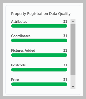 Image Modified Image Modified |
Property Management & Property Management Data Quality
Property Management Property Management quality - as a percentage Hovering over the chart highlights how many property records are being reviewed and, out of those, how many have been contacted and how many have a future next call date set
Clicking the chart shows a grid highlighting the areas where the contact is missing (can be changed to where contact has been entered)
Clicking the grid shows the relevant properties
| 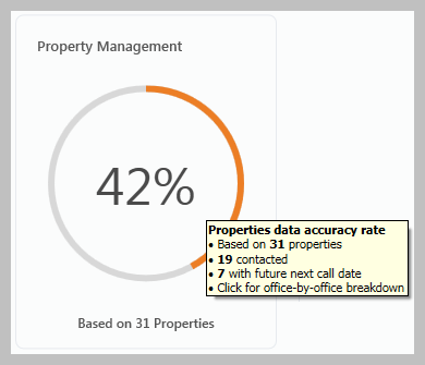 Image Modified Image Modified |
Property Management Data Quality Property Management quality - broken down by type Hovering over the chart highlights how many property records are being reviewed
Clicking the chart shows a grid highlighting the areas where the contact is missing (can be changed to where contact has been entered)
Clicking the grid shows the relevant properties
| 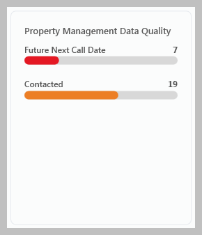 Image Modified Image Modified |
| Info |
|---|
How often contact is required and what is classed as ‘contact’ can be changed - see Settings section for more information |
Settings
Accessing Settings | 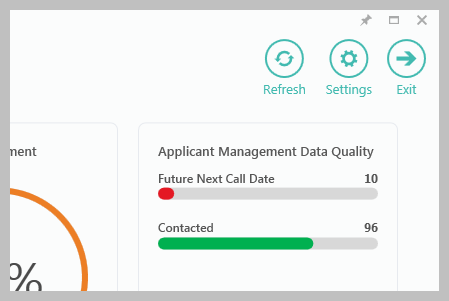 Image Modified Image Modified |
Settings options All Settings options are shown below 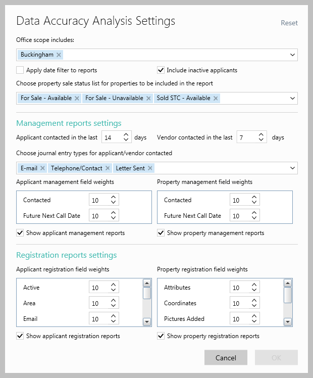 Image Modified Image ModifiedOffice scope includes Apply date filter to reports When unticked, the current status of all applicants and properties is shown When ticked, the data shown is for properties/applicants registered in the current month - any month within the previous year can also be chosen using the drop-down menu
Include inactive applicants Choose property sale status… Management reports settings Applicant/vendor contacted in the last xx days: the duration that determines contact has been made between the agent and applicant/vendor Choose journal entry types…: journal entry types that represent contact being made with an applicant/vendor Applicant/Property management field weights: weighting allows you to focus on which activities are more important - see 4a for further information Show applicant/property management reports: un-ticking this option removes the Applicant/Property Management panel(s) from the dashboard
Registration reports settings Applicant/property registration field weights: weighting allows you to focus on which activities are more important - see 4a for further information Show applicant/property registration reports: un-ticking this option removes the Applicant/Property Registration panel(s) from the dashboard
| Expand |
|---|
| title | 4a. Changing weighting settings |
|---|
| Each percentage chart on the dashboard can be altered so that the more important statistics can be more heavily weighted when the weighted average is calculated.
The default is for all statistics to be weighted equally For example, if users are missing recording applicant requirements but are highly competent at recording their contact details, the Settings screen could be used to change the statistical weightings, so that completing applicant requirements is weighted more heavily than other statistics. The numbers shown in the field weights sections above are the score each field is currently being given; the default being 10, which equates to very high. The lower the number assigned, the less priority is given to that field; to discount it altogether, 0 can be entered. For this example, the Requirements field setting should remain at 10, with other fields being downgraded, as appropriate: 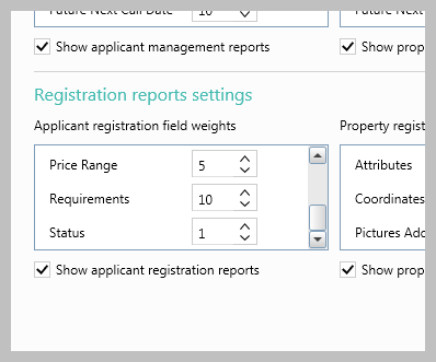 Image Modified Image ModifiedUsing default weightings When each field is weighted equally (with each field set to the default of 10), the Applicant Registration metric is at 91% and the weighted averages are calculated, as below 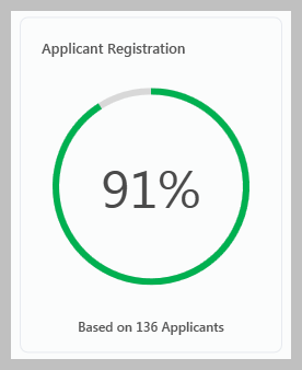 Image Modified Image Modified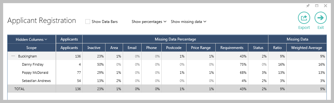 Image Modified Image ModifiedChanging field weightings When the field weightings are changed (as shown above), giving high priority to Requirements and lower priority to all other fields, the metric is at 78% and the weighted averages as below; using a weighted average calculation reflects in the overall percentage to encourage negotiators to improve performance of the targeted metric 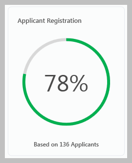 Image Modified Image Modified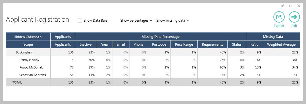 Image Modified Image Modified |
|
Data grids
Viewing data grids Data grids are available to allow you to drill down to view the data behind the chart/statistic Click on a blank area of a panel to see the data behind the whole chart/statistic in that panel
OR Click on a section of a chart to see the data for just that area See example in next section Clicking any figure within the breakdown displays the related applicant/property records, allowing individual records to be viewed Data shown by default is the missing data, i.e. data not entered into
|
AgencyCloud |
Data grid features The data behind a chart/statistic clicked is shown in a grid
The example below is shown when clicking the Applicant Registration panel 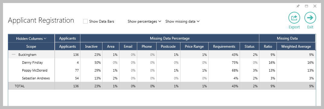 Image Modified Image ModifiedClick the column headings to sort by that column (ascending/descending) Click Export to export the data shown to an Excel spreadsheet Click a figure in the grid to see the associated records
In the example above, when clicking a viewing figure, the relevant list of applicants will be displayed
|
Show data bars Ticking Show Data Bars displays coloured bars that represent each figure in the grid based on its ratio with the percentage of the total figure 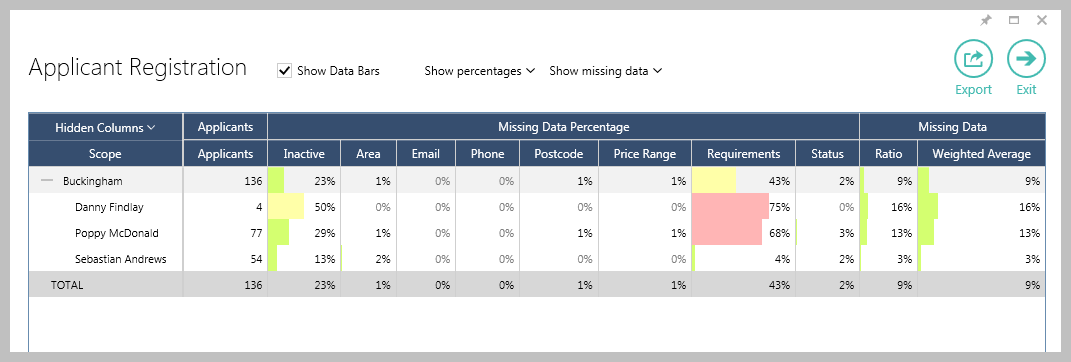 Image Modified Image ModifiedTicking Show Data Bars displays coloured bars that represent each figure based on its ratio with the percentage of the Total figure
The shading width and colour differs to indicate the % share of the overall total of that figure; green shading indicates the figure being in the top third of the overall figure, yellow indicates the middle third and red the bottom third
|
Related articles
| Filter by label (Content by label) |
|---|
| showLabels | false |
|---|
| max | 5 |
|---|
| spaces | com.atlassian.confluence.content.render.xhtml.model.resource.identifiers.SpaceResourceIdentifier@a45 |
|---|
| showSpace | false |
|---|
| sort | modified |
|---|
| showSpacetype | falsepage |
|---|
| reverse | true | type | page
|---|
| labels | rps sales reporting dashboard productguide |
|---|
| cql | label = "dashboard" and type = "page" and space = "RW" | labels | rps sales reporting dashboard productguide |
|---|
|
| Excerpt |
|---|
|
Outline of the main features and how to use the Data Accuracy Analysis dashboard |
...